7 Days Closer
A warm, reverent, grounded identity — parchment, leather, and serif letterforms. Every value on this page is lifted from the live site, which is the reference for anything produced for the brand.
Lockup
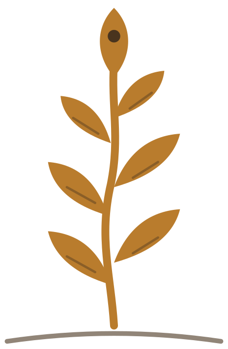
The horizontal lockup pairs the wheat-stalk mark with the wordmark. It is the identity used in the site navigation and footer, and the first choice anywhere there is horizontal room: web, email signatures, partner decks.


Wordmark
The name set in Fraunces 700, uppercase, with 0.16em letter-spacing — exactly as it appears in the site navigation. Bark on light backgrounds, Parchment on dark. Never re-track, condense, or set it in another face.


Logo Files
Raster and SVG files for use in external apps (social media, email signatures, merch). Click any card to download.

Color Palette
Click any swatch to copy the hex. Parchment is the page background; Espresso for headlines and Bark for body; Mid and Soft for secondary copy; Wheat for borders and dividers; Amber for accents, links, and every CTA (Amber Light on hover).
UI Elements
The building blocks as they render on the site. Reproduce these, don't reinterpret them.
Start the Challenge
Answer three quick questions so each passage is chosen for you.
Typography
Fraunces anchors the brand: the wordmark, every headline, and scripture passages. Outfit is everything else — body copy, buttons, navigation, labels. Raleway 300 appears only on a few secondary pages (onboarding, completion, journal) for soft sub-copy; never on the homepage or in UI.
to God
Voice & Tone
Warm, reverent, direct. We're talking to real people going through hard things — not preaching, not marketing.
Do
Don't
Need a specific asset?
If you're a partner, podcast host, or press contact and need a specific format (EPS, transparent PNG, brand one-pager PDF), email us and we'll send it over.
[email protected]